Introduction
The Multi-Location Report in BLogic View gives owners and managers a unified view of sales performance, payment methods, product analytics, and operational data across all your store locations in one place. This article walks you through how to access the report, apply filters, read each section, and switch between table and chart views. Use this report to quickly compare location performance and make data-driven decisions for your business.
Version Support
| Product / Module | Supported Version |
|---|---|
| BLogic View — Reports | 06.05.2026 |
Note: If you do not see the Multi-Location Report in your sidebar, please contact Support to confirm your account has access to this feature.
Table of Contents
- Access the Multi-Location Report
- Apply Date, Time, and Location Filters
- Read the Summary Tab
- Understand Location Performance and Distribution
- Explore Sales & Operations Hub
- Review Menu & Product Analytics
- Analyze Revenue & Transaction Data
- Review the Adjustment Summary
- Switch Between Table and Chart Views
- Export or Print the Report
- FAQ
Access the Multi-Location Report
Step 1: Log in and navigate to Reports
- Log in to BLogic View with your Owner or Manager account.
- In the left sidebar, click Reports to expand the menu.
- Click Multi-Location Report.
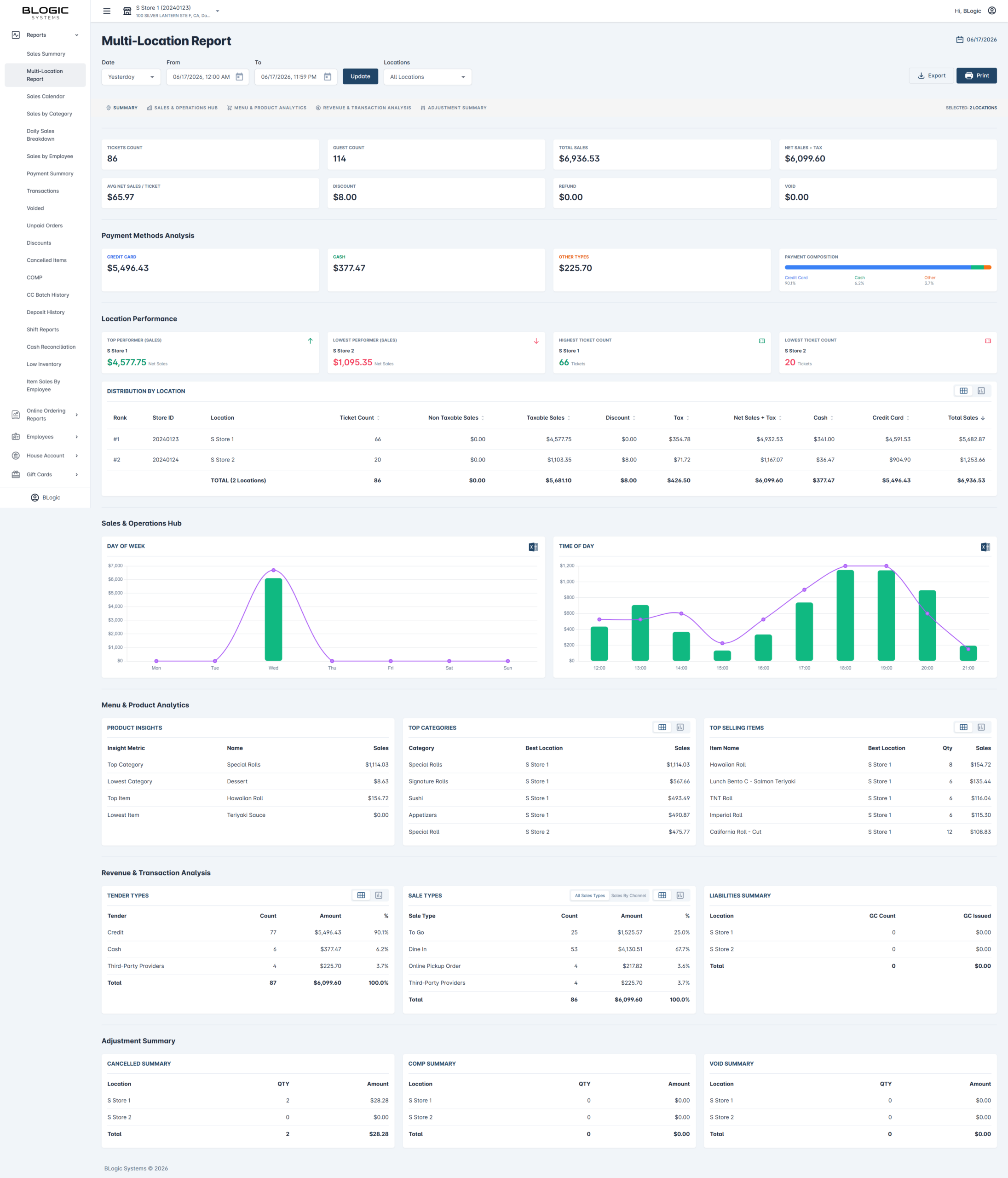
The report will load and display the Summary tab by default for the currently selected date range and locations.
Apply Date, Time, and Location Filters
Step 1: Set the date range
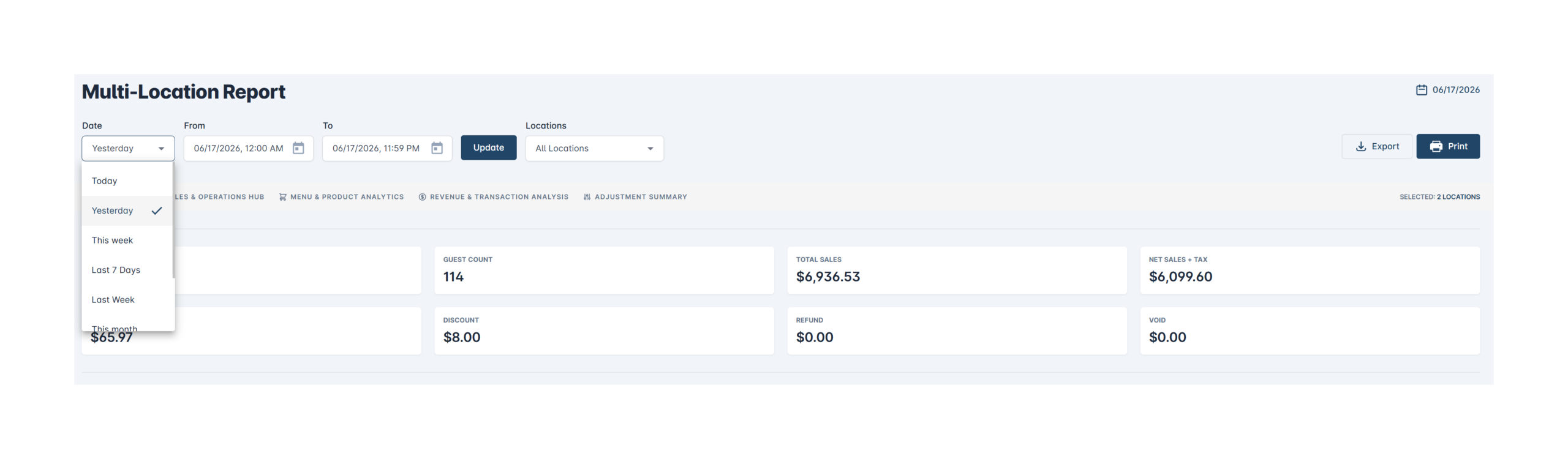
- At the top of the report, find the Date dropdown (default: Last 7 Days).
- Click the dropdown to choose a preset range (e.g., Today, Last 7 Days, Last 30 Days) or select a custom range using the From and To date/time pickers.
- Adjust the From and To time fields if you need to filter by a specific time window within each day.
Step 2: Select locations
- Click the Locations dropdown on the right side of the filter bar (default: All Locations).
- Select one or more specific locations, or leave it as All Locations to see data across your entire business.

Step 3: Apply the filters
- Click the blue Update button to refresh the report with your selected filters.
✅ Tip: The date range currently displayed is shown in the top-right corner of the page (e.g., 06/12/2026 – 06/18/2026) for quick reference.
Read the Summary Tab
The Summary tab provides a high-level snapshot of your business performance for the selected period and locations.
Step 1: Review top-level metrics
At the top of the Summary section, you will see eight key metrics:
| Metric | What It Means |
|---|---|
| Tickets Count | Total number of transactions processed |
| Guest Count | Total number of guests served |
| Total Sales | The overall grand total across all revenue components |
| Net Sales + Tax | Net sales amount including tax collected |
| Avg Net Sales / Ticket | Average revenue per transaction |
| Discount | Total discounts applied across all locations |
| Refund | Total refunded amounts |
| Void | Total voided transaction amounts |

Step 2: Review Payment Methods Analysis
Below the top metrics, the Payment Methods Analysis section breaks down how customers paid:
- Credit Card — Total credit card revenue
- Cash — Total cash collected
- Other Types — Third-party providers, gift cards, or other tender types
- Payment Composition — A horizontal bar chart showing the percentage split between payment methods

Understand Location Performance and Distribution
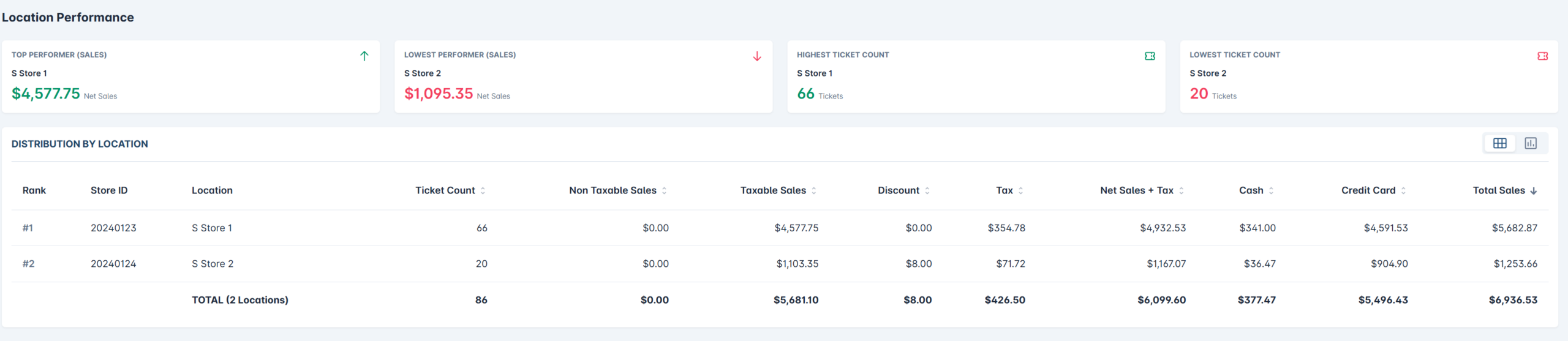
Step 1: Review Location Performance highlights
The Location Performance section automatically identifies:
| Card | Description |
|---|---|
| Top Performer (Sales) | Location with the highest net sales |
| Lowest Performer (Sales) | Location with the lowest net sales |
| Highest Ticket Count | Location that processed the most transactions |
| Lowest Ticket Count | Location that processed the fewest transactions |
Step 2: Read the Distribution By Location table
The Distribution By Location table (or chart) shows a per-location breakdown with the following columns:
| Column | Description |
|---|---|
| Rank | Location ranked by Total Sales (highest = #1) |
| Store ID | Unique identifier for each location |
| Location | Store name |
| Ticket Count | Number of transactions at that location |
| Non Taxable Sales | Sales not subject to tax |
| Taxable Sales | Sales subject to tax |
| Discount | Discounts applied at this location |
| Tax | Tax collected |
| Net Sales + Tax | Total net revenue including tax |
| Cash | Cash collected at this location |
| Credit Card | Credit card revenue at this location |
| Total Sales | Total sales for this location |
The Total row at the bottom summarizes all locations combined.
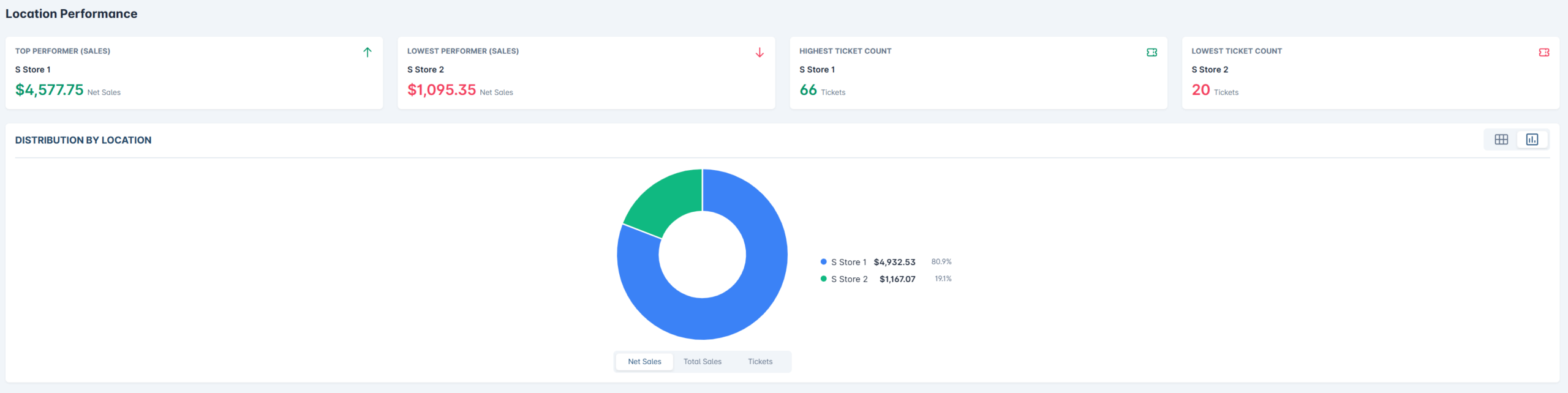
ℹ️ Note: You can toggle this section between a table view and a donut chart view. See Switch Between Table and Chart Views for details.
Explore Sales & Operations Hub
The Sales & Operations Hub tab (also accessible as a section when scrolling) shows when your business is busiest using two charts.

Step 1: Review Day of Week performance
The Day of Week chart displays a bar and line graph showing total sales for each day of the week (Monday through Sunday). Use this to identify your busiest and slowest days.
Step 2: Review Time of Day performance
The Time of Day chart shows how sales are distributed across the hours of the day (e.g., 11:00 AM to 11:00 PM). Use this to understand peak service hours.
✅ Tip: Use these charts together to plan staffing, promotions, or operational changes during peak and off-peak periods.
Review Menu & Product Analytics
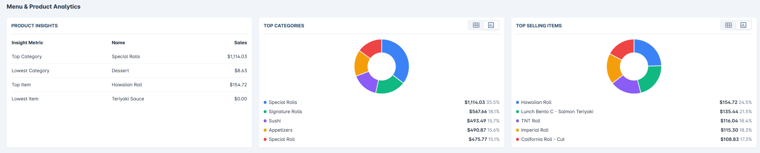
The Menu & Product Analytics section helps you understand which items and categories are driving revenue.

Step 1: Check Product Insights
The Product Insights table highlights your best and worst performing items:
| Insight Metric | Description |
|---|---|
| Top Category | Category generating the most revenue |
| Lowest Category | Category generating the least revenue |
| Top Item | Individual menu item with the highest sales |
| Lowest Item | Individual menu item with the lowest sales |
Step 2: Review Top Categories
The Top Categories table (or donut chart) shows each category’s total sales and which location performed best for that category.
Step 3: Review Top Selling Items
The Top Selling Items table (or donut chart) lists your best-selling individual menu items, including:
- Item name
- Best-performing location
- Quantity sold
- Total sales
Analyze Revenue & Transaction Data
The Revenue & Transaction Analysis section breaks down how transactions were completed and what types of orders were placed.

Step 1: Review Tender Types
The Tender Types table shows a breakdown of payment methods used:
Step 2: Review Sale Types
The Sale Types table shows the breakdown by order channel:
| Sale Type | Description |
|---|---|
| To Go | Takeout orders placed at the POS |
| Dine In | In-restaurant orders |
| Online Pickup Order | Orders placed via online ordering |
| Third-Party Providers | Orders from delivery platforms |
Step 3: Review Liabilities Summary
The Liabilities Summary shows Gift Card activity per location, including GC Count and GC Issued amounts.


Review the Adjustment Summary
The Adjustment Summary section (also accessible via the top tab) tracks exceptions and manual adjustments made during the period.
Step 1: Check Cancelled Summary
Shows the number and total amount of cancelled items per location.
Step 2: Check Comp Summary
Shows the number and total amount of complimentary (comped) items per location.
Step 3: Check Void Summary
Shows the number and total amount of voided transactions per location.

⚠️ Warning: High cancellation or void counts may indicate training issues, system errors, or potential loss of revenue. Review these regularly.
Switch Between Table and Chart Views
Several sections of the Multi-Location Report support toggling between a table view and a donut chart view for easier visual comparison.
Step 1: Find the view toggle icons
Look for two small icons in the top-right corner of each supported section (e.g., Distribution By Location, Top Categories, Top Selling Items, Tender Types, Sale Types):
- Grid icon — Switches to the table/list view
- Chart icon — Switches to the donut chart view
Step 2: Click to switch views
- Click the grid icon to see detailed numbers in a table.
- Click the chart icon to see a visual donut chart with percentage breakdowns.
ℹ️ Note: Both views show the same underlying data — the toggle is for display preference only and does not affect the report data.
Export or Print the Report

Step 1: Export the report
- Click the Export button (top-right corner of the page).
- The report data will be downloaded in your configured export format.
Step 2: Print the report
- Click the Print button (top-right corner of the page, next to Export).
- Your browser’s print dialog will open. Adjust settings as needed and confirm.
✅ Tip: Use the Adjustment Summary tab before printing to include exception data in your printed records.
FAQ
1. Why can’t I see the Multi-Location Report in my sidebar? This report is available to Owner and Manager roles. If you don’t see it, your account may not have the required permission level, or your store may not be configured for multi-location reporting. Contact Support to confirm.
2. Can I filter the report for just one specific location? Yes. Click the Locations dropdown in the filter bar and select the specific location you want to view. Click Update to refresh the report.
3. What does “Net Sales + Tax” mean compared to “Total Sales”? Total Sales is your gross sales figure before any deductions. Net Sales + Tax reflects the net amount after discounts are removed, plus the tax collected. Use Net Sales + Tax for your revenue reporting.
4. Why does the Day of Week or Time of Day chart look different from what I expected? These charts are based on the date range and locations selected in your filters. If you recently changed the filters and didn’t click Update, the charts may still show old data. Always click Update after changing any filter.
5. What should I do if a location’s data looks incorrect? Double-check that the correct date range and time window are applied. If the data still appears incorrect after refreshing, contact Support and provide the Store ID and date range for investigation.
Closing
The Multi-Location Report gives you a powerful, consolidated view of your entire business in one screen. Use it regularly to compare location performance, identify top-selling products, and track operational trends.
If you still need help, please contact BLogic Support for further assistance.
BLogic Systems © 2026